
5/26/2026 · 4 min read · Neurixco Team
Data Tables: turn your sources into sortable tables with live charts
The Tables tool extracts structured data from your sources, renders a sortable table, and auto-generates a bar chart on top — perfect for benchmarks, comparisons, and stat round-ups.
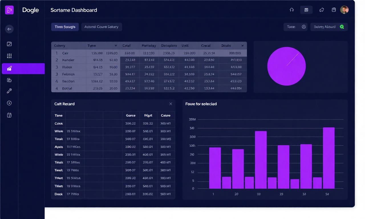
What the Tables tool does
Drop a PDF, paste a report, or include a few articles, then open Tables in the Canvas rail. Neurixco reads the sources, extracts the most relevant rows and columns, and renders a sortable table with a live bar chart on top that auto-picks the most numeric column.
A 30-second walkthrough
- Open a study or research workspace and toggle on the sources you want to compare.
- From the Canvas rail, click Tables → Generate.
- Neurixco produces a table (sortable headers, wrapped labels) plus a mini bar chart above it.
- Click any column header to re-sort. Negative values render in rose; positive in violet.
When to use it
- Researchers — benchmark studies, side-by-side metrics, citation counts.
- Businesses — competitor pricing tables, feature matrices, KPI snapshots.
- Students — historical dates, comparative case studies, scientific constants.
Edit, version, export
Use Edit with AI to add a column ("add a YoY % change column"), and Version History to roll back. Export to CSV or PNG from the Export menu.